Development
Golfsmith Home Page Enhancements
The Golfsmith home page (HP) enhancements were an ongoing, constantly evolving project. Luckily, I had the opportunity to lead a huge overhaul of the strategy and design of the HP in 2016. Offer sections were cut. Content marketing sections and featured categories were brought in. And engagement and conversion increased because of it. Learn more about my process below.
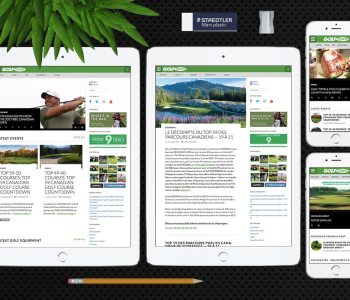
Golfsmith Home Page
Progression
Since the start of my employment with Golfsmith, the HP changed drastically. Consequently, I assisted the UX Manager in the UI CSS development for updates made in 2015 and led the header redesign in late 2015. As stated above, I had the opportunity to lead the 2016 redesign project. The screenshots below are a brief overview of the progression of the HP.
NOTE ON LIVE EXAMPLES: As of 11/4/16, Golfsmith is no longer conducting business and all associated websites are offline.


UX Planning for 2016 Redesign
Competitive Analysis
I started out by monitoring the HP content strategy of top retailers. Therefore, I focused on Golf Galaxy, DSG, Academy, REI, and SportChek as competitors in the sports and outdoors category. Due to breadth of brand offerings and clean design, I also focused on Gap, Home Depot, Sephora, Target, and Williams-Sonoma.
At Golfsmith, we updated the HP daily with several savings stories. After monitoring competitors for a couple of weeks, I noticed some strong differences in their HP strategy and scheduling.
Wireframes and Prototypes
Another thing I noticed during my competitive analysis were common threads throughout each HP. More oft than not, the HPs included the following:
- Featured category call-outs
- Link to a new arrivals category
- Eye-catching call-out to the sale/clearance/deals page
- Content marketing features
- An incentive to join the loyalty program
- High-rated, recommended products

Opposite to this strategy, Golfsmith was loading the HP with product offers and savings stories. Hence, my suggestion was to move towards the category- and content-based home pages trending in retail at the time.
After a few wireframe iterations, we reached a balance that the marketing, e-commerce, and merchandising teams could agree on. It seems like the roll-out of Amazon’s category-based HP might have strongly influenced the final decision.


A/B Testing
Finally, once the home page was developed, A/B testing of the new HP against the old was performed through Optimizely. The test reached statistical significance within a couple of days.
Conclusion
As a result of A/B testing, the newest version of the homepage produces significantly higher customer engagement and increased revenue. In conclusion, overall revenue has seen a steady increase since launch.
Credits:
- 2016 UI Development Collab: Bastien Buchaca
- 2015 Redesign Lead: Omar Gonzalez